One of the most effective tools in a designer’s toolbox is color, which functions as a silent language that conveys urgency, passion, and brand values before a word is even read. Understanding color psychology when creating a poster might mean the difference between a potential customer pausing to interact and a bystander turning away.
Here’s a look at how certain colors affect judgment and how to make good use of them in your designs.
1.The Palette’s Emotional Effect
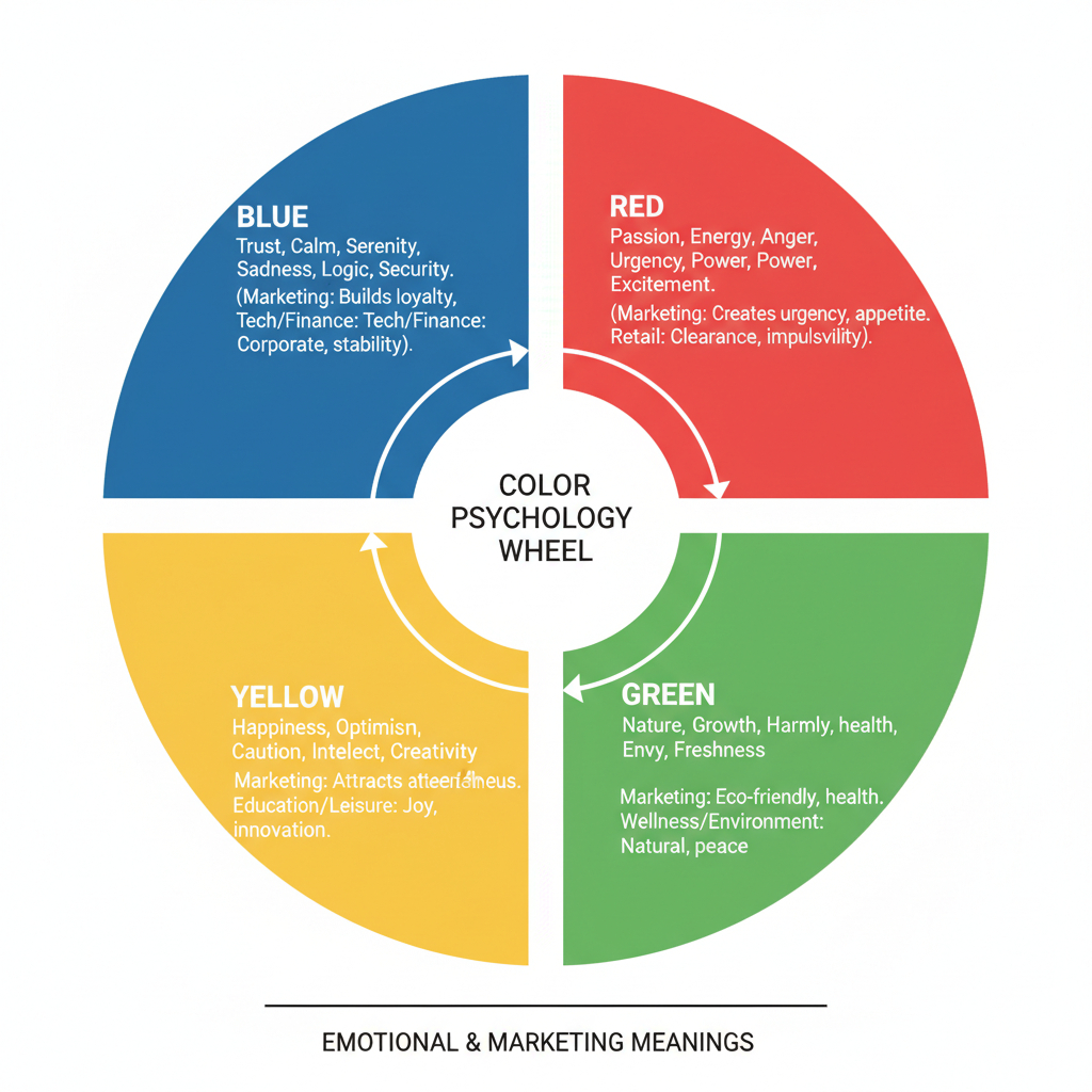
Every hue elicits a psychological reaction in the subconscious. The “mood” of your message is determined by your choice:
- Blue (Trust & Professionalism): Used extensively by IT, banking, and corporate brands. It inspires sentiments of steadiness, discernment, and dependability. If the goal of your poster is to establish professional authority or long-term trust, use blue.
- Red (Urgency & Passion): Red produces a sense of urgent action and raises heart rates. Because it commands attention, it is the gold standard for “Clearance Sale” or “Limited Time Offer” posters.
- Yellow (Optimism & Clarity): The human eye interprets yellow as the first color. It conveys happiness and affordability. Use it sparingly to prevent eye strain, but it’s great for emphasizing important information or call-to-actions (CTAs).
- Green (Growth & Health): Linked to ethics, leisure, and the natural world. Posters promoting organic goods, sustainability, or wellness resorts work very well with it.
- Black and Gold (Luxury & Sophistication): Gold lends a feeling of distinction, while black exudes strength and grace. This combination is perfect for executive branding, high-end events, and the introduction of luxury products.
2. Readability and the Rule of 60-30-10
No matter how “psychologically correct” the colors are, a poster that is difficult to read will not convert. Designers frequently adhere to the 60-30-10 rule in order to preserve balance:
- 60% Primary Color: The unifying or backdrop color.
- 30% Secondary Color: Applied to graphics or mid-level components.
- 10% Accent Color: Set aside for your headline or “Call to Action,” which are your most crucial pieces of content.
3. Contrast: The Crucial Element of Navigation
Contrast guides the viewer’s gaze in addition to improving a poster’s appearance. The message will be readable from a distance if there is a high contrast, such as black writing on a yellow backdrop or white letters on a deep navy. The “Join Now” button or contact information should have the highest contrast on the page if you want a customer to make a decision.
4. Trends and Cultural Context
Although there are universal principles in color psychology, the environment is important. For instance, in many Western cultures, white is associated with purity, yet in other Asian cultures, it can also be associated with grief.
Minimalist gradients and cinematic lighting, in which colors interact with light and shadow to create depth rather than being flat, are also popular in contemporary design trends. This gives a brand a sense of modernity and value by adding a degree of reality and quality.
5. Playing with “Wildcard” Palettes
Even though it’s easy to conform to industry-standard colors (such as green for food or blue for technology), occasionally breaking the norm is what draws in customers.
The Contrast Play: Try a bright electric purple or teal if all of your rivals use red for sales. These hues let your poster stand out in a crowded space while still feeling contemporary and vibrant.
The Earthy Modern: By combining delicate creams with deep terracotta, a brand can appeal to clients seeking authenticity while also feeling grounded.
An overview
Choose colors that support the objective rather than just colors you enjoy when creating your next poster. Consider this: What do I want them to feel first? The palette will come to you organically once you have defined the emotion.